
Terminalcoffee discussion
Viewing & Listening Pleasure:
>
Paint
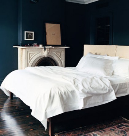
 I love all three. Notice the difference that the trim makes to the color in two and three. I would not like white trim as well with the first blue.
 This is gray but I am in love with it.
Farrow and Ball Down Pipe.
 Mod
Mod

 Mod
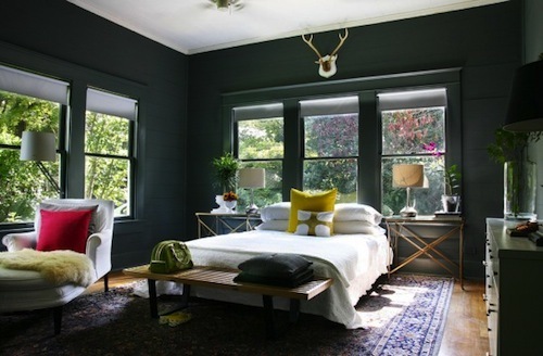
From left to right: Benjamin Moore - Downpour Blue, Behr - Nightshade #740f-7 and Benjamin Moore - Hale Navy.
Mod
From left to right: Benjamin Moore - Downpour Blue, Behr - Nightshade #740f-7 and Benjamin Moore - Hale Navy. Mod
Hale would be my choice from that group.
Mod
Hale would be my choice from that group.Huh. It appears we were thinking alike on the gray. I can't go quite that dark of a gray. It would swallow my house. I wish I could, though. I did as dark of a gray as I could in my kitchen. It is light by comparison to Downpipe.
Mod
 Hmm. I still really like it. It does not read as nice of a blue without the natural light, though.
I wish people would stop framing intaglios.
Mod
 It almost looks like one of those "suede" paints. I don't care for it.
 Lobstergirl wrote: "One of my neighbors has a dark gray accent wall in her living room, I think the rest of the walls are white or some..."
I don't like accent walls. Nope, I don't.
Sure, there's one in our living room, but only because I've been too lazy to pick out new color and paint the room.
I agree. It doesn't feel complete to me.
Mod
To me it looks like the cabinets are a different color than the sueded walls. I don't like textured effects either.
Mod
Just do it.
Yes, it does look like two different finishes from walls to cabinets. Not a fan of all that going on, either.
Mod
 I'm loving these dark blues! I've wanted to paint my walls red for ages, but now navy is seeming like a good option too...
Sometimes, a professional design group can be overrated.
Mod
I once thought I needed a red kitchen in my life. I wanted it to be that kind of a rich red, too. Then we bought our house and the kitchen walls were painted half red and half yellow by the previous owners. I could not stop thinking of Ronald McDonald every time I looked at it. It was the first room to be painted within the first weeks of moving in.
Mod
I'm loving these dark blues! I've wanted to paint my walls red for ages, but now navy is seeming like a good option too...
Sometimes, a professional design group can be overrated.
Mod
I once thought I needed a red kitchen in my life. I wanted it to be that kind of a rich red, too. Then we bought our house and the kitchen walls were painted half red and half yellow by the previous owners. I could not stop thinking of Ronald McDonald every time I looked at it. It was the first room to be painted within the first weeks of moving in.
Mod
 But the finish was so thought out in how it would bounce the blue onto all the rest of the blue. Then there are those lights.
Mod
Or the sex room for some swingers?
But the finish was so thought out in how it would bounce the blue onto all the rest of the blue. Then there are those lights.
Mod
Or the sex room for some swingers?One can only guess.
Mod
Mod
Mod
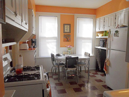
 The day before I had my last colonoscopy, I was thinking about painting my kitchen.It came to me during pre-op that the perfect color would be a very pale cantaloupe. I bought the paint the next day and am now questioning my judgment (which is, under the circumstances, reasonable). Any thoughts on pale cantaloupe as a kitchen color?
Mod
The day before I had my last colonoscopy, I was thinking about painting my kitchen.It came to me during pre-op that the perfect color would be a very pale cantaloupe. I bought the paint the next day and am now questioning my judgment (which is, under the circumstances, reasonable). Any thoughts on pale cantaloupe as a kitchen color?
Mod
Or this:
 Mod
Mod
 Mod
That's not the color. It's very pale cantaloupe. What we have here is rotten cantaloupe! Lighten it by 7 shades.
Mod
That's not the color. It's very pale cantaloupe. What we have here is rotten cantaloupe! Lighten it by 7 shades.

 My parents' dining room is about the color in message 37 and I love it.
Mod
Mod
Lobstergirl wrote: "41-42 just look white and beige to me."
My parents' dining room is about the color in message 37 and I love it.
Mod
Mod
Lobstergirl wrote: "41-42 just look white and beige to me."Hey, Scout said 7 shades lighter.
Mod
Since she's already bought the paint, maybe she can post a paint chip.
Mod


Drawing Room Blue, Farrow and Ball.
More Drawing Room Blue.
Not sure what this is: