
Support for Indie Authors discussion
note: This topic has been closed to new comments.
Archived Workshop No New Posts
>
WIP Cover Help Please
date newest »
message 1:
by
Melonie
(last edited Apr 17, 2017 05:36PM)
(new)
Apr 17, 2017 05:34PM
 Hi. This is a WIP cover, so it's under contruction, but I would appreciate any thoughts on it. Please and thank you.
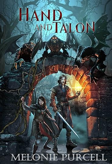
reply
|
flag
 As a thumbnail, the title will be difficult to read. The art seems okay.
 I think overall it's a pretty solid cover. It tells a story of what to expect in reading. My only issue is that the title gets a little lost in the background. Not sure what the best way to fix it is though, I'm no artist.
 Ahhh, Miss Melonie!
*waves*
Well, you already know how much I freakin' adore your other cover annnd I really like the artwork for this one too. Gotta say, though, that the contrast on the other is much more striking but again, still so pretty. Hmm. Personally, I don't think it's important to have a legible title in thumbnail at all but that's definitely not the popular opinion LOL
Bestest of luck!
Hugs,
Ann
 Love it!
It has the feel of traditional fantasy books. To make the title pop, I'd try to do like them and use a metallic color, gold or silver, or maybe even a light copper, with a 3D ish look.
Else, I wouldn't change a thing. :)
 I think the artwork is very strong, but agree that the title may be a bit hard to read. It's difficult, though--an obvious solution would be a brighter color, but that might spoil the darkness of the rest of the cover. There is a bit of silver shadow on the letters--enhancing that might do the trick. Good luck!
 Compositionally this is a very attractive cover. And, at this size or larger, I like the color of the title. However, thinking about thumbnail sizes, it would be incredibly hard to read (as others have stated). Honestly though, it's a minor gripe. The artwork itself is attractive enough to warrant a closer look, in my opinion.
 I think this is a very, very good cover. The colors pop, I am able to read the title clearly. The images are profound...I would pick it up from a book shelf in a book store. I used to be in marketing in a previous career so i think I am qualified to tell you that your cover is solid. If I am to make one criticism it would be to make your name in a brighter color.
Without reading the blurb, i could guess what the book is about by the images on the cover.
 Art is great. But... Title Font color and size needs to be thicker and higher contrast so it is readable as a thumbnail.
The cover art nicely conveys the type of book it is.
 It's a very pretty cover. And emotive. Maybe the words need to be somehow picked out, but I wouldn't change too much.
Thanks so much for your help and suggestions. I appreciate it!
It's a very pretty cover. And emotive. Maybe the words need to be somehow picked out, but I wouldn't change too much.
Thanks so much for your help and suggestions. I appreciate it!
 I just checked out your other cover. Just as gorgeous as this one! Why not keep the same font as that one? It will look amazing on this book cover. And it could look nice to keep the font style consistent with all your books under the same pen name/genre/series.
 Agree with Frances that the Shield of Drani title font would stand out better and also add a 'house style'. But otherwise a stunning cover.
 I just want to say I'm in love with that cover. Maybe a larger title (which others have said)... but it has a good feel to it.
 what is the girl holding in her hand? my eye is drawn to her hand that is held up.
Thanks so much everyone! I really REALLY appreciate the help.
what is the girl holding in her hand? my eye is drawn to her hand that is held up.
Thanks so much everyone! I really REALLY appreciate the help. @Frances - Thanks for the kind words on my other cover. The artist is Radovan Zivkovic and I think he's wonderful.
@Mary - That's part of why it's a WIP. She will be holding a dagger and pulling back the vines. It's amazing what he can do!
 As others have said, enlarging the font would be a good idea. Other than that, this looks like a book I would want to read.
 Question...are the man and woman depicted part of the story? Is this a comic-book? Because they don't look like real people. Perhaps that's you're intention, if so...then I'll shut up.
 Hi - At the risk of agreeing with everything already said, I think the artwork looks great, and I would try to make the title larger/more distinctive so it can be read at smaller sizes.
 As has been mentioned, consistency between your books is a good idea, so if there are fonts/colours that you can pick up from a previous book, that might be a good plan.
One thought could be to tie the colour of the title to the colour of the glowing light the man is holding. That light is one of the warmest parts of the image and your eye is drawn to it. If you made the title a similar colour it could help it to both stand out from the bluer background and give a nice consistency between the different elements (artwork and title).
But, main thing, it looks great!
 I'm with everyone else - love the cover, but the title could do with being more distinctive.
 The artwork is stellar - and memorable, but the title seems odd - especially the 'N' at the end of Talon... why is it in a larger font size?
 I love the illustration but I agree the title is lost in there even at this size. It's amazing how common problem this is ... most illustrators (or all of them?) have an extremely hard time placing in titles and making them work. I'd focus on making the title work better.
 It's a bit hard to see the title.
The rest of the cover looks amazing!
Changing HAND AND TALON to a shiny metallic color would be a lot clearer to see, maybe gold or silver?
One could tweak a book cover until the cows come home. But it's your one and only chance to convey the content. Don't waste it.

 I think the cover is very eye-catching. It is a bit dark (as in looks like the action is happenng in the dark) and I would make the name lettering pop out more - blends in a bit too much with the cover artwork.
Pat wrote: "Great graphic but, as others have suggested, MAKE TITLE AND AUTHOR'S NAME MUCH, MUCH LARGER. As you can see in my thumbnails below, I thought both were huge, but you can barely read the type on eit..."
I think the cover is very eye-catching. It is a bit dark (as in looks like the action is happenng in the dark) and I would make the name lettering pop out more - blends in a bit too much with the cover artwork.
Pat wrote: "Great graphic but, as others have suggested, MAKE TITLE AND AUTHOR'S NAME MUCH, MUCH LARGER. As you can see in my thumbnails below, I thought both were huge, but you can barely read the type on eit..."Sorry Pat. Have to delete as this is considered a bookwhack.
Thank you all so much. It really helps having a second opinion. Hope I can return the favor.
As requested, I am now closing the thread. Thank you everyone for giving Melonie your input. :)
This topic has been frozen by the moderator. No new comments can be posted.

