Twice in the Past Two Decades
No, this post isn’t about anything sensational. It isn’t about more coalition-driven wars started in the world. It is about markets and their crashes. A subject I’ve not written about for some time.
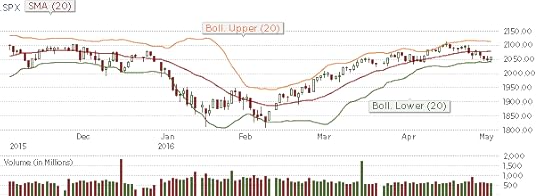
SP500 6-month chart : The end of 2016 to the present
A prior post of some months ago urged courage in the face of intense market volatility. It was – if memory serves me right – the beginning of the year when I’d thought the market, while in a sharp nosedive, will recover to near its prior levels. How could anyone have predicted that it’d retrace back all the way to its prior highs? Not only did SPX touch 2100 again, volatility has fallen to its lows of the year too.
What caused this despite a decidedly lacklustre earnings season this quarter? And a not-so-robust economy? Perhaps the gradual recovery of oil prices. Or perhaps actions of the FED, or its inaction despite having made the first tentative step toward normalizing interest rates. I don’t think it is new money coming into the market, but I do not really know. Perhaps money flowed back from markets in Asia where dramatic corrections have occurred.
But this is no time to be complacent!

SPX weekly chart, 1991-2016, and technicals (pic: Marketwatch/northmantrader.com)
The prior caution of a possible deeper plunge in the markets in 2016 remains a distinct possibility. The Bull Market continues to be very long in the tooth. Lessening volatility in a tentative market that has seen dramatic volatility recently isn’t a sign of vigor. This seven-year bull run, driven by the FED’s money printing (fiscal policy) and low interest rates (monetary policy), is looking rather tired. And Albert Edwards, a strong bear of SocGen, points out with his chart above that a technical indicator – the SPX 100-week moving average rising above the 50-week MA has occurred only twice in the past two decades. And, in both those instances, markets have plunged precipitously.

Zoomed-in view, SPX 100-wk above 50-wk MA, volatility
Here’s a magnified view of the chart above. You can click on both charts to see them on their own in their full resolution. The line in yellow – the slower trend line – is the 100-week MA, and the 50-week MA is in green. What the crossover signifies is that recent volatility is trending down while the longer term trend remains upward. Lower lows recently in the SPX, and lower highs, in other words.
I think Albert Edwards’ bear stance is well-supported by the technical analysis above. Heading into summer, on a weak economy, and less than impressive first quarter results, the markets look rather weak. From the first chart above, I’d say any upside may face resistance at ~2075 in the SPX. And such upside will most likely be very short-lived.
Disclaimer/Disclosure: I am short SPX with a small position in a volatility instrument. Invest with caution always. I am not affiliated with any financial or other institution engaged in investments promotion or transactions.
~~~~~~~~~~~~~~~~~