
So You Want to Make a Book Teaser…
Today’s #MarketingMonday post is for readers, writers and bloggers alike. Making graphics, like a book teaser or a quote card, can really make a review or social media post POP. But the how-to can be daunting for people without any graphic design background.
I’m doing a workshop on this at the Romancing the Capital conference in Ottawa this May, so as I was pulling together my notes for that, I thought…this would make a great blog post! So you guys are getting the top-level starter point-form notes. I’d love to hear any feedback or questions you have in the comments.
So the basics of any book-related graphic are image + text.
Images for Book Teasers
First rule of teasers: use royalty-free stock photography. Why? Images are copyrighted, just like books are, so unless you have express permission from the photographer to use it, assume you can’t. Even as a reader, I’d recommend you avoid using pictures of celebrities and models. Yes, I know some people do it, even big name authors. They’re taking a risk.
 If you are going to make a lot of images, I recommend watching AppSumo for their deals; they have one for a hundred-image pack from DepositPhotos a few times a year that’s an excellent value. Another option is to do a monthly subscription at BigStockPhoto — or even just their trial of 5 or 7 days that they run every so often. Just make sure you cancel before the week or month is up to avoid getting charged for another month (and if you do, max out that month, too!).
There are free stock photo options, too: MorgueFile and Unsplash are the two I visit the most. These are great for landscape pictures especially. This blog post from Bootstrap Bay lists 17 free photo sites you might want to visit.
Adding Text
Okay, so you have a picture that evokes a scene or a character from a book that you love, and now you want to add a quote or a teaser line to it. So you need software beyond Microsoft Paint, because if you’ve ever tried to do this in Paint, you’ve quickly realized that once you plunk down the words…you can’t move them around.
In graphic design, being able to move each element around independently is important. So you need to use something that allows you to operate in layers.
 I use GIMP for most of my graphic design work. It’s robust and it’s free. But it might be overwhelming for someone who is unfamiliar with photo editing software, so for purposes of this blog post, I tried out a web-based graphic service called Canva and I was really impressed! You can move text chunks around independently, and they have a nice selection of free images you can use, too. The lumbersexual teaser on the left I made in Canva, using a free image from their library. I added a second font, which took some clicking around to figure out which layer I was on to move stuff where I wanted it, but pretty easy to use, for sure.
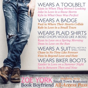
The Book Boyfriend All Access Pass graphic above, I made in GIMP. Notice that in both graphics I’m using two different fonts for visual interest. And I tried to put the text on the parts of the picture where it would pop — and in the one on the right, I added some white shadow to help with that.
This is just a really simple starting point. Once you get going, there’s a world of text effects, image blending, layers, graphic design rules (rule of thirds is king!) and much more to learn, but if you’ve got a picture and you know how to put text on it in a way that pleases your eye, that’s a huge first step.
Let me know how it goes for you!
Save


