
Pretty Paris note cards… is there anything better than stationery? Non.
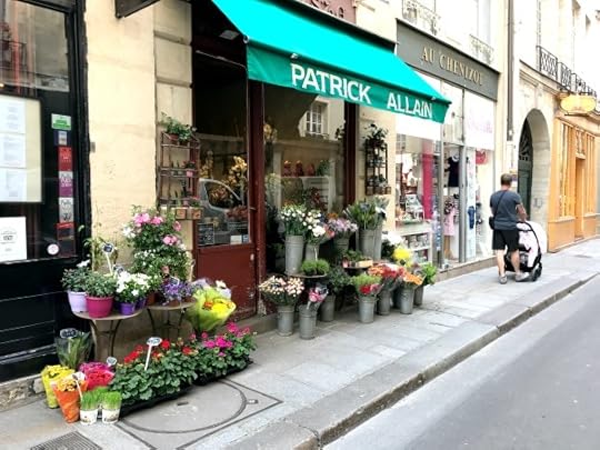
So I’m inside a stationery shop in Paris. Christophe is standing outside with Amélie because the stroller won’t fit in the store. This is a big issue in Paris. Teeny tiny lanes inside stores of breakables make the nostrils of Parisian cashiers flare even more than normal. This is what Paris looks like to me:
There they are, walking ahead slowly while I take yet another photo. And…

They both don’t like waiting. They also don’t like waiting outside stores. They basically just put up with me.
So they are waiting outside the stationery shop.
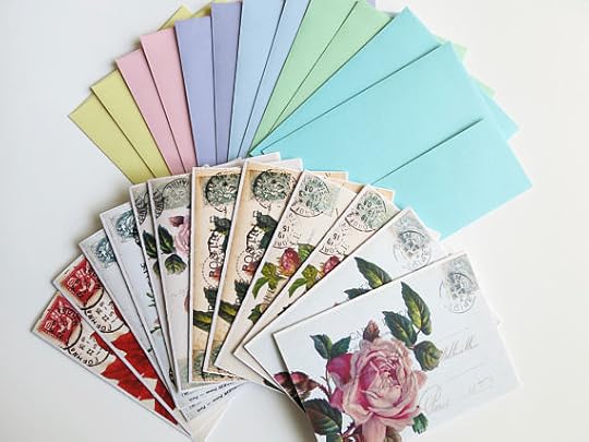
I don’t have a lot of time. The shop is good and so full of beautiful PAPER. I’m such a paper nerd. I can deliberate far too long in front of a wall of cards and envelopes. But this time, I don’t have time to mull so I just buy everything I grab on my first tour of the store. I spend way too much cash on a bunch of pretty paper. I feel slight guilt in the moment, but after I come home I spread it all out over the bed and relished in the glory of pretty paper. So nice! I am like Sharon Stone in Casino…

But instead of jewels it is paper.
As I survey the paper, I come to three realizations:
The folder the paper is in can be just as delightful. Stationery sets are much more fun to have when you can slowly open the clasp to pull out your stationery.

Having a collection of cards rather than many copies of the same card was much more fun for sorting and deciding which of my pen pals would get which card.

Having pretty envelopes to go along with the note cards elevates the whole situation. I was floored by how many stationery sets had boring plain envelopes… like they didn’t think it through. But when the envelopes were nice, I relished the idea of addressing them to friends and family.
But not one of my stationery sets have all three elements. So that’s when I huff, puff and declare to the world, “I’m making my own stationery sets!” And that’s what I do. Thus far, I have two darling stationery sets in my shop.
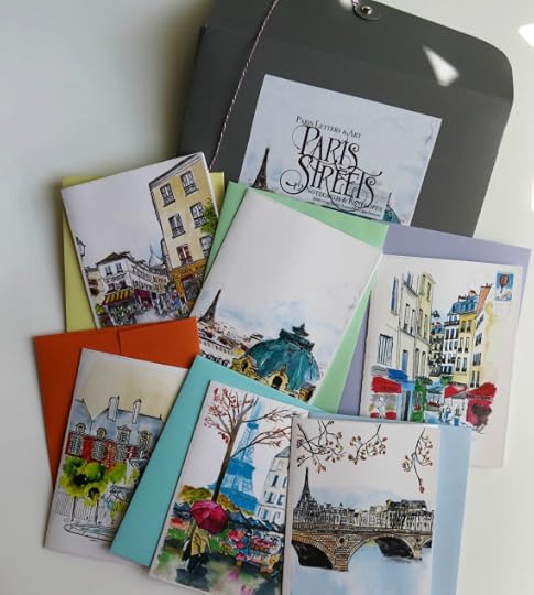 Not surprising given my delight in painting Paris street scenes for the ol’ Paris Letters. Notice the orange envelope. It’s called Tangerine. How delicious.
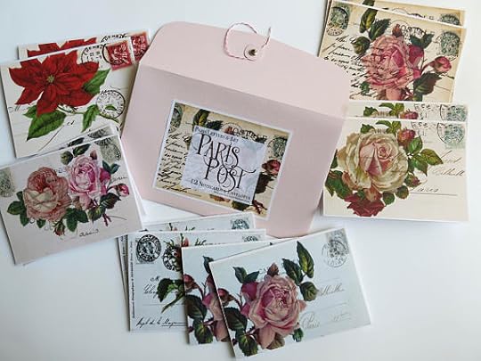 Also not surprising given my delight in all things philatelic. This collection is based on the postcards I found at flea markets around Paris. The penmanship of yesteryear France makes my teeth tingle.
I’ve got a few other collections in the works, but they require a deeper delve into font research. Speaking of, I received a fan letter the other day…
J’aime your book. Okay, my French is abysmal… I just got your book: A Paris Year, and absolutely love it! My question to you is this: what typeface did you, or your graphic designer/publisher use? It looks like it’s handwritten, but clearly, it is not. I love it. At any rate, it is such a fantastic book/work/journal/sketchbook. Bravo to you!
My reply…
The search for the perfect font is a long, arduous journey. And I’m the graphic designer of the book as well as the writer so you know I was a control freak about the whole thing. There are three fonts, The body copy is called MaryDale (I used the alternate stylistic set that substitutes a few less quirky letter forms. The original lowercase “g” was driving me crazy.). The headlines are Tuesday Script with the occasional Bruselo capital letter tossed in here and there for flare.

Some of the postcards I found that day became the note cards I posted on my shop today. Funny how life works.
So my love/neurosis about stationery is matched only by my love/neurosis of fonts. This is why it takes so long to design a project… oh, and this…
So glad I organized all those diapers.
Save
Save
Save
Save
Save
Save


