There are many things an author can be excited about during the course of a writing career. New ideas that spark an entire story or unique character. Having the pieces of a plot fit together as if we'd designed it that way from the start (that's usually not the case with seat-of-the-pants writers). Sharing our work with others, from family to editors to reviewers to readers across the world.
Ranking with all of that is the first moment an author gets to see the cover—the presentation of a visual interpretation of our story. From a marketing point of view, this is of course one of the most important selling features a book possesses.
To start with, covers need to express information, such as if the book is contemporary or historical. But more than that, it should indicate the
kind of book. What genre? Obviously the portrayal of a romance will be different from that of a horror novel. The use of light is especially important here, the book's first promise of what the pages contain.
But covers, to an author, are far more than a selling tool. The picture on the front should evoke an emotional response that captures a little of the emotion the story strives to convey. It should invite the reader in, make them look forward to an experience with a whole new cast of characters in a setting they're either curious about or already know they would enjoy.
Because of the importance of that image, authors usually feel more than a little anticipation when it comes to seeing our cover for the first time. I know we need to trust the experts on this, those with far more experience in marketing than most authors, but it nonetheless feels like part of the personal investment we put into our work—only it's one we often times don't have much control over. We create the story, but in traditional publishing we don't create the cover.
Despite the fact that I'm so rarely disappointed with the cover art from my publisher, every time I receive an email from my editor containing the first draft of the cover direction, I open that particular email with a little prayer.
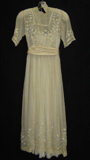
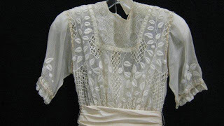
This time I already knew what the model portraying my heroine, Meg, would be wearing. Going on information from the book, the Tyndale design team scouts costume and vintage dress shops for something that might fit. Here is a picture of the dress they used for my character to wear:

Full length viewWhen my editor shared this picture with me, we were both excited because it immediately reminded both of us of a specific scene from the book.

Isn't the detailing gorgeous?
Here's the description of what Meg will be wearing to an outdoor concert, circa early 1880s in Central Park, New York City. See if you think it's a perfect fit:
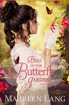
The afternoon was warm and so Meg chose the lightest of her white muslin dresses, the sheerest lace gloves, the smallest hat of straw with the tiniest paper flower embellishment. The trees were still young in the Ramble where the concert was to be played, so there would be little shade. In deference to the close proximity of seating she would bring her most petite parasol of brushed chiffon, the one trimmed simply in lace rather than fringe that might otherwise impede the view of someone nearby. A delicately carved white wood fan was an absolute must.And so with the sheer lace and addition of the perfect gloves, here is what the wonderful Tyndale cover design team came up with:

What would you say this book expresses? Romance, I hope, because of the lovely young model portraying my heroine. It's the first of my new Gilded Age series, so the warm, inviting gold shining from the background hints the era. My heroine is also an avid gardener—specializing in gardens known to attract butterflies—so having her tending the roses is a perfect touch!
Needless to say, I'm so excited about this newest addition to the family. I have a few months to go for delivery of this one, with a June release date, but if this past year is any indication of how quickly time passes, the next few months will speed by!

 newest »
 newest »
 It's beautiful! The dress AND the cover. Your covers are always so pretty.


