
How to predict a student's SAT score: Look at the parents' tax return
This weekend, triggered by a few readers who disagreed with my assertion that socioeconomic status is a huge driver of educational attainment and performance, I decided to respond the way any nerd would in my situation: I made a chart.
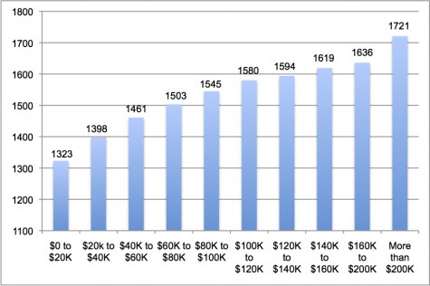
In a moment of Excel fervor, I took data from the College Board's 2011 Total Group Profile Report of college-bound high school seniors and plotted the mean combined (Reading, Math, and Writing) SAT scores for various income cohorts.
Take a look at the chart below. On the horizontal axis is family income. On the vertical axis is the combined average SAT score for students from families in each group. The general story is pretty simple: The higher the parents' income, the higher their kids' SAT scores.
(And this, sadly, is but one example. For a fuller account of the link between income and education, see the work of Duke's Helen Ladd.)


It is logical and expected that the Highest Level of Parental Education also explains the difference in income: education and effort = earning power. The data for your chart based on income level had 42% with "no response" rendering the sample hoplessly biased. In contrast, the data for scores based on Parental Education had only a 8.9% "no response" rate, meaning it yields more a reliable analysis.