
Stalking Shadows' New Cover?
Hi Everyone,
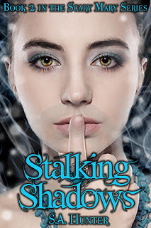
I'm playing around at designing a new cover for Stalking Shadows. I want to get it in-line with Scary Mary. Please tell me what you think? The edges of stuff are still rough because this is a mock-up, and there is a watermark over the model's face. I haven't bought the rights to the photo yet. It is the same model as the one on Scary Mary. Can you tell it's the same girl?
Tell me what you think! (And if you can think of a better tag line, share! ;-)
ETA: I also did a quick variation because I forgot that Scary Mary did not have its title in caps. I like the way the caps look, but for consistency, the lower case may be better. Does anyone have a preference? I omitted the tagline from the cover on the second one because there's no nice place to put it and I don't even know if I want it on the first one.


No comments have been added yet.


